“Now the game is just telling me what I can do!”
That was a friend’s reaction after playing with the changes from the last blog post. It’s not working the way I expected…
This is one of the most magical and, at the same time, frustrating aspects of game design: hypothesis, implementation, realization and iteration. I feel it’s also one of the reasons why this is such a risky medium to work in. Unless you are copying existing solutions, it’s hard to know if your concept will work or how expensive it will be to get there.
So I thought it would be interesting to share where I’m at.
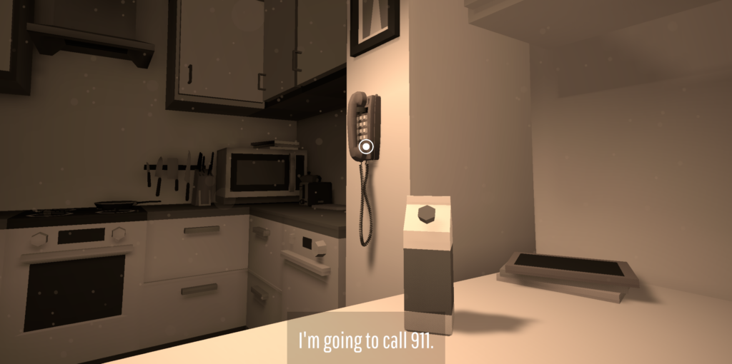
The problem is that I have a systemic simulation running underneath everything, but at the player interaction level I was flattening it into a list of authored options.
The last blog post started with the goal of solving three things:
- Create urgency.
- Remove ambiguity from the choices.
- Make Eve’s own intention clear.
Create urgency.
This led to implementing a ‘slow motion’ moment of choice instead of having the scene always play out in real time. Now that time ‘freezes’ when you need to make a choice, each moment can be much more dynamic. I can also see a lot of room to explore that transition artistically, similar to that famous Quicksilver kitchen scene in X-Men, or the Black Mirror episode “Eulogy.
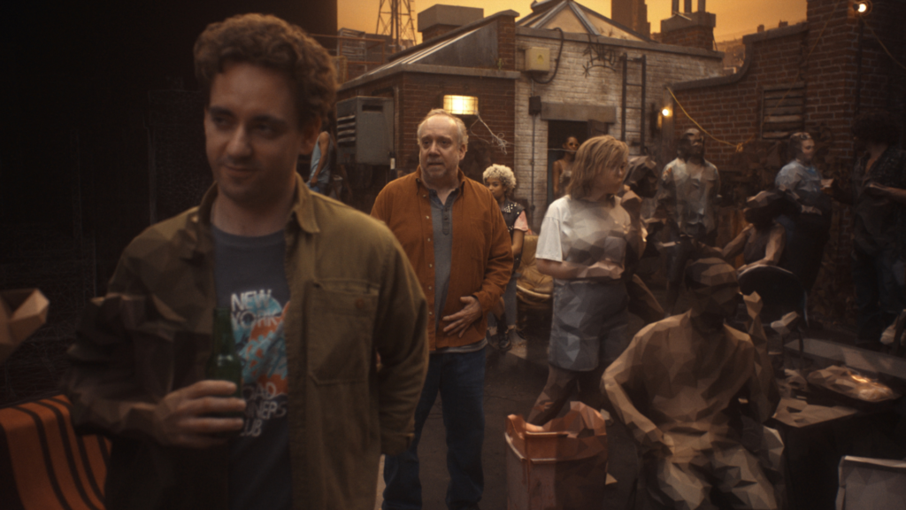
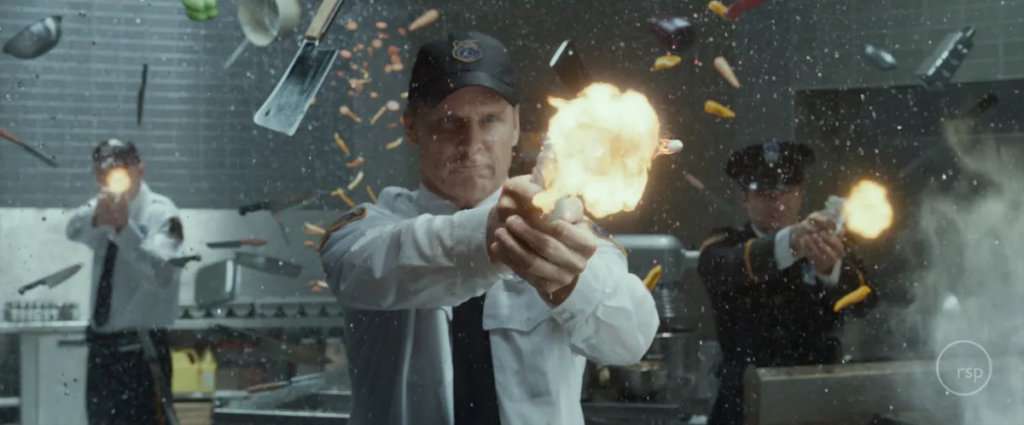
This also means the scenes themselves can be dynamic. You can be running, falling, swimming, driving. It doesn’t matter. Time will always stop and allow you to decide what to do next.
In the last post I paired this with a timer, where Eve would act on her own if you didn’t step in. In practice you ended up interrupting her in every single scene, and that friction made no sense.
Remove ambiguity from the choices & Make Eve’s own intention clear
These two created an unexpected issue. Instead of engaging with the scene, you start scanning it for ‘available actions’. In the heart attack scene example from the previous blog post, we ended up with an environmental menu:
- I want to call 911
- I want to help Dad.
- I’m asking Mom for help
The environment wasn’t something you were reading and acting through anymore. It was just displaying the authored choices. And hearing Eve’s thought first only made it worse. Her voice is far better as a surprise, in what she says once the choice is made.
Reflection
So I took a step back and looked at other systemic genres, like shooters and platformers.
For example, in a platformer, the designer doesn’t decide that in this particular room clicking a crate means “climb onto it.” The player already understands their abilities: move, jump, grab, etc.
The level designer then creates situations where those same actions take on different purposes. I’m not just climbing. I’m climbing the tower to save the princess.
To be clear, the underlying choice structure should remain the same. It’s what drives the butterfly effect, and all agents follow the same rule set.
The issue isn’t the choices themselves, but how they are presented to the player.
In the previous version, I tried to remove ambiguity by explaining every choice. Now I’m trying to remove it through consistency instead.
Since the whole game is practically playable, and I’ve already built several scenes, I have a long list of items that you interact with. So I started to look for patterns and realized that:
- There is no inventory: No combining items with the environment.
- Each choice moves you forward immediately: You need to understand the action before committing to it.
- Each scene is brand new to the player: The action must be clear from the object itself.
There are also two high-level categories:
- Characters: You always talk to them
- Objects: You either observe or use them
And then I realized I’m back at the same conclusion I reached when I was creating Twelve Minutes. The issue is ambiguity:
What does USING an object actually mean? How can a SINGLE ACTION be clear?
Some objects are obvious:
- Piano: play it
- Light switch: turn it on/off
- Pizza slice: eat it
- Present: open it
- Door: open it
While others are confusing:
- Glass shard: ?
- Knife: ?
- Hands: ?
- Book: ?
- Casket: ?
So I went through every existing scene and asked: can I replace ambiguous interactions with objects whose action is immediately clear? So far, I can. I’m going to try implementing three clear ‘verbs’ based on what you are looking at:
- TALK (Mouth Icon)
- OBSERVE (Eye Icon)
- USE (Hand Icon)
And a simple design rule:
“If the player cannot predict the action from the object alone, it isn’t a valid direct interaction.”
The consequences can surprise you. The action itself cannot.
So going back to the heart attack scene, it should now become
(icons only — the text below is just me describing what each one does):
- PHONE, USE icon: Dial 911
- FATHER, TALK icon: Dad, are you ok?
- DOOR, USE icon: Open the door, Eve sees Mom and ask for help
This obviously looks like adventure-game language: TALK, OBSERVE, USE. And in many ways, it is. The difference is what I’m asking the player to figure out.
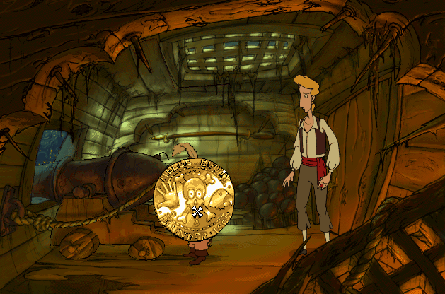
There is no inventory, no combining objects, and ideally no guessing what action an object represents. Every interactive object has one clear affordance. You may not know what will happen because of your action, but you should know what action you are choosing.
The puzzle isn’t figuring out what USE means on a particular object. It’s deciding what to do, when to do it, and understanding how those choices can change Eve’s life. TALK, OBSERVE and USE become a consistent grammar the player can carry from one scene to the next.
Will this give the player a grammar they can learn, understand and eventually plan with? Or will it simply feel like an adventure game without an inventory, where every new scene is still a collection of things to click?
Not sure. Implementing it now….